Meet Your Maker UI
The mandate on this project is to be a blend of new Sci-Fi mixed with old, grungy vibes. We take inspiration from Returnal and Alien Isolation and use a limited colour palette. The colour palette has proved to be one of the most difficult (and most fun!) constraints so far for UI in terms of how we work with Visual Hierarchy, Accessibility, and Readability. It’s been so much fun to work with these challenges!
Raider HUD
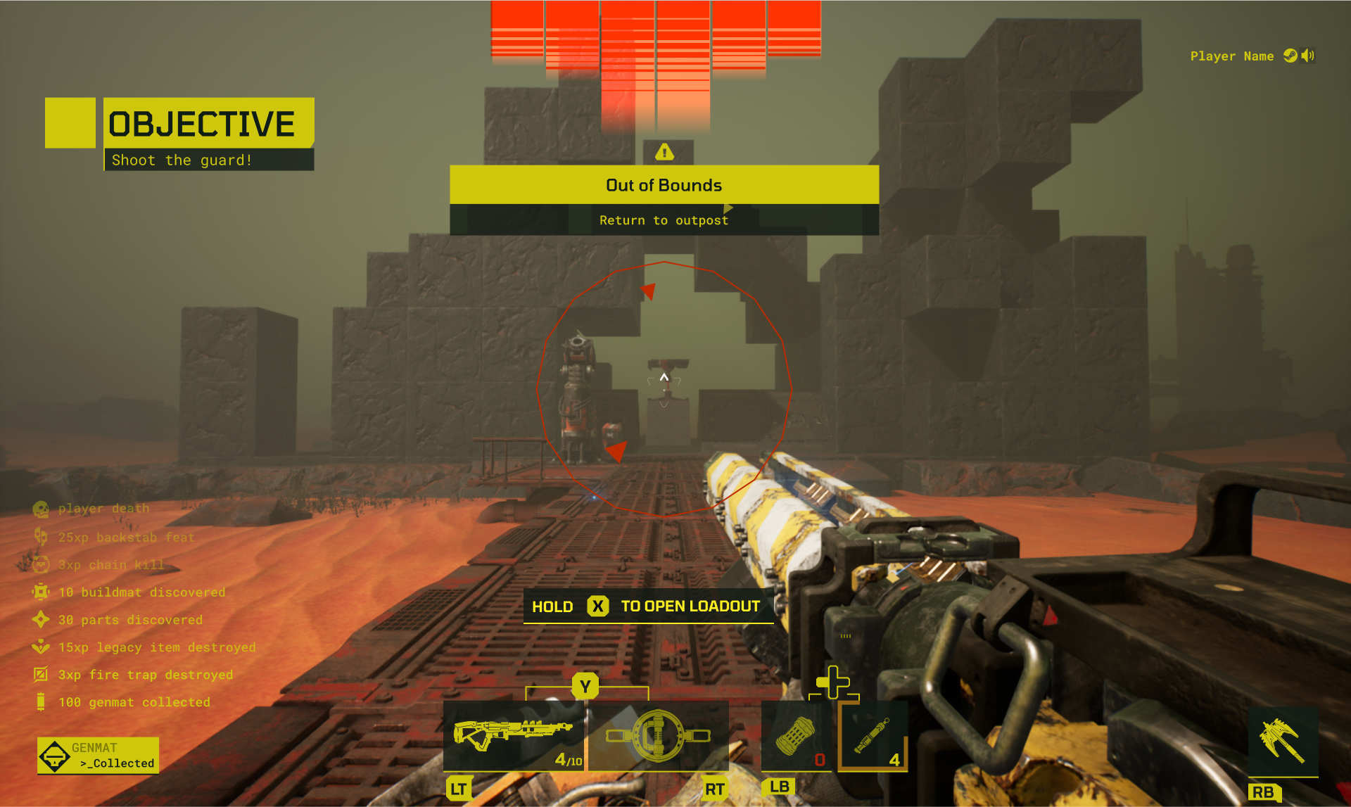
The Raider HUD is one of the first aspects that I had the pleasure of working on. The image below is the final design that I integrated in-game (with the help of the programmers!). I was responsible for the design and implementation of the danger indicators which appear on the top, bottom, and sides of the screen.
Raider HUD Videos
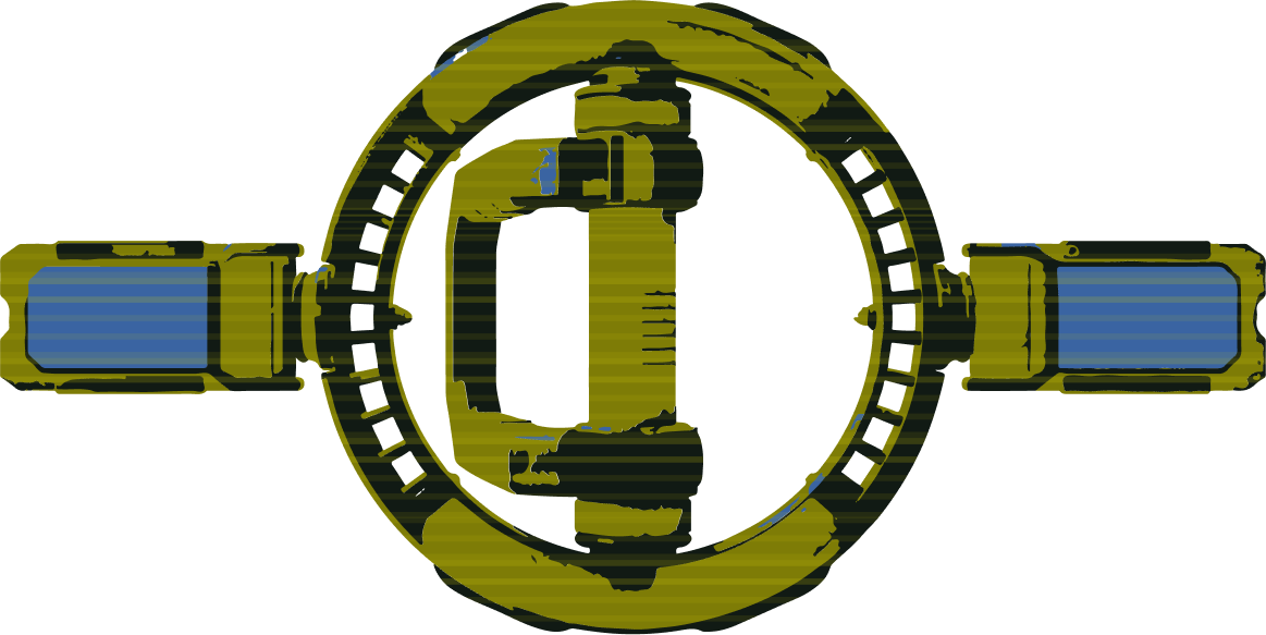
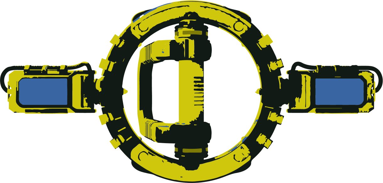
In this video, you can see how the danger indicators respond to different attacks. The indicators on the sides of the screen indicate a general direction of impact, whereas the middle danger indicator is responsible for showing you projectile proximity and lethality to the player.
Loadout Proposals Mockups
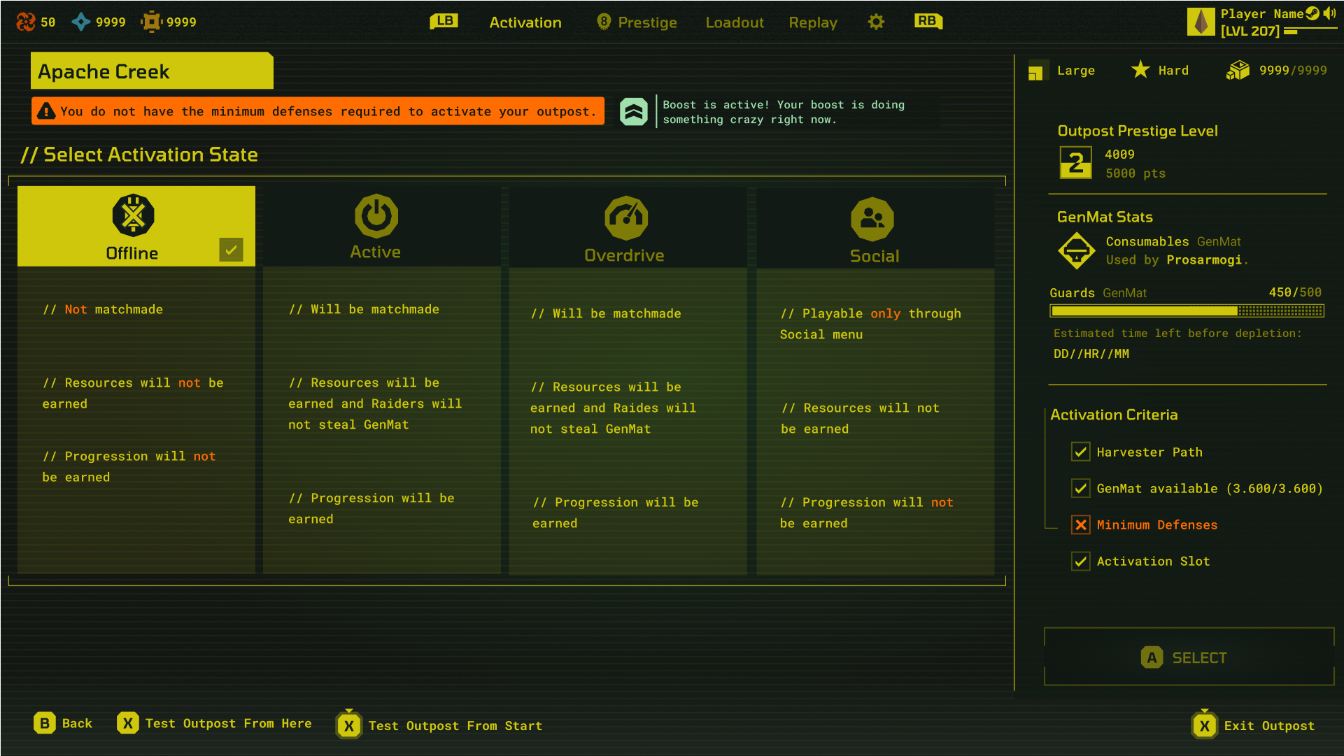
I was in charge of proposing designs for the Loadout screen. Below are examples of the mockups that I proposed.


Prestige Screen
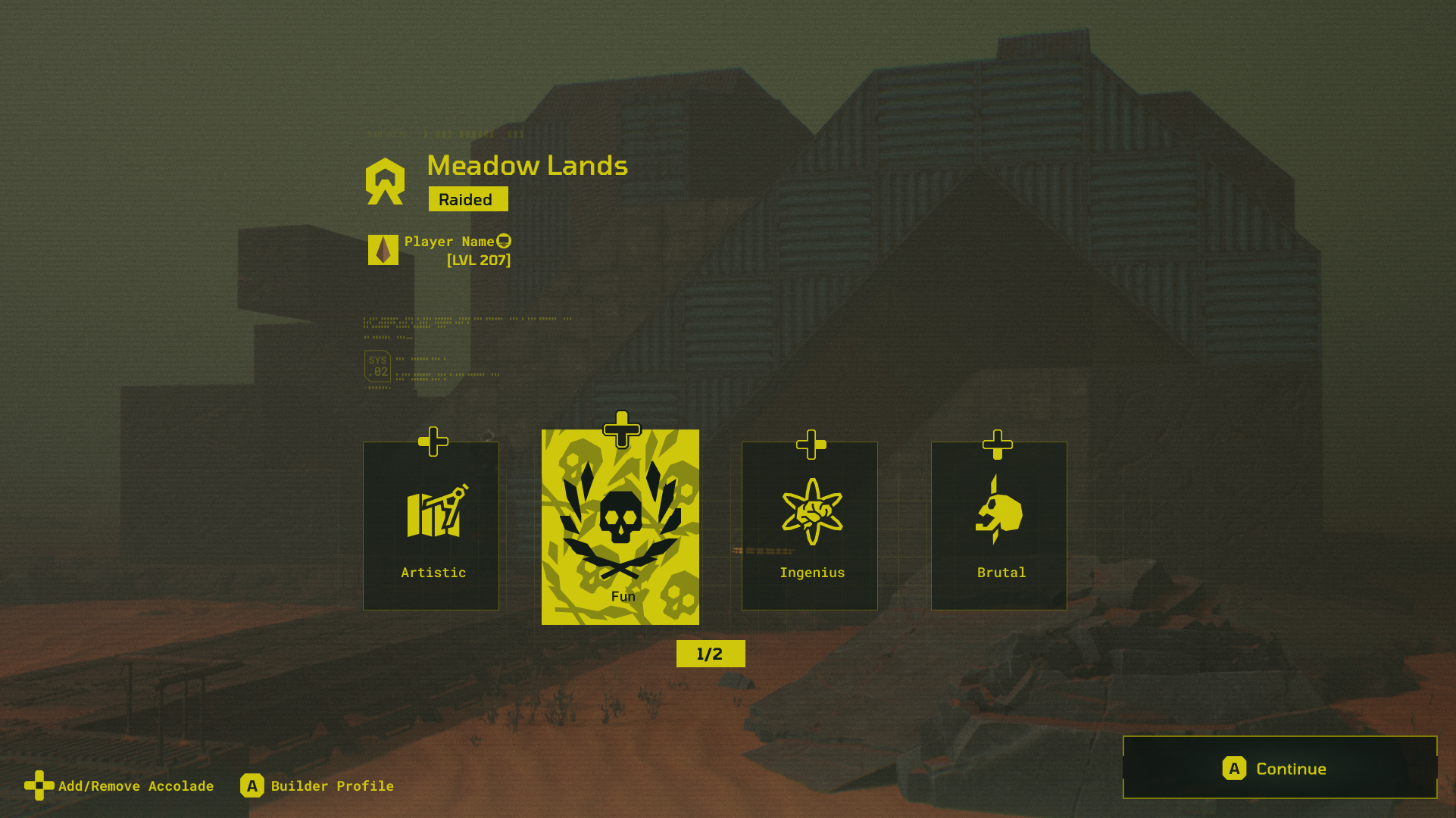
Builder Options Menu Explorations
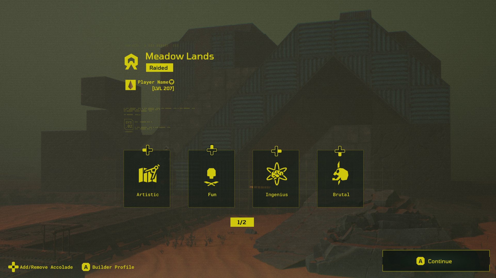
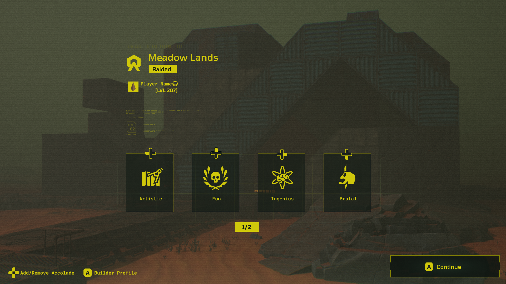
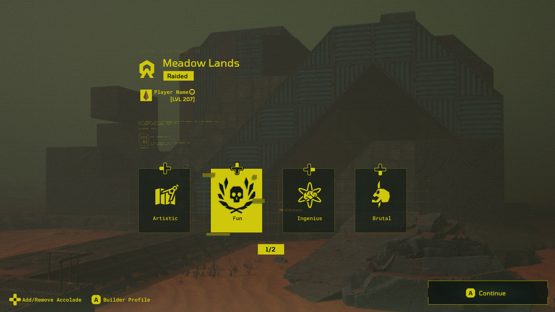
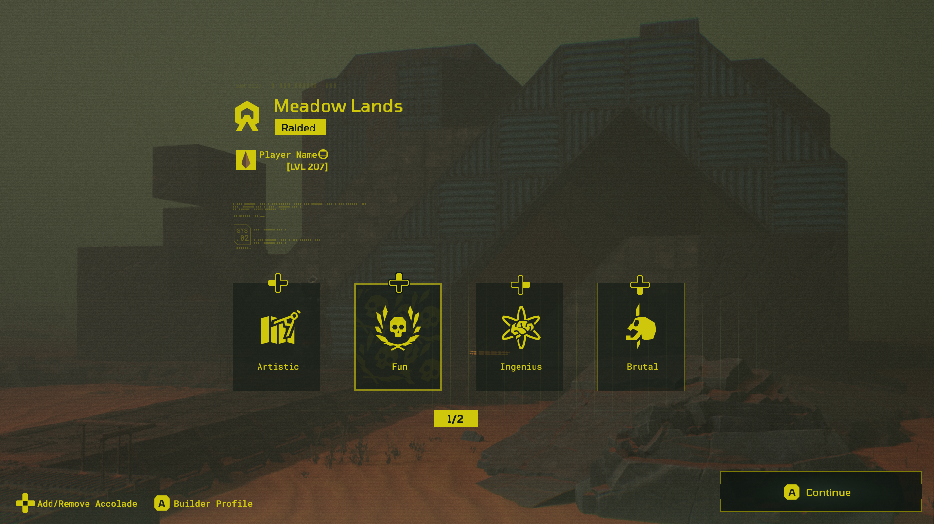
The section is for one of the major screens with some really complex design behind it! I made a channel pack shader in Unreal to work with the icons you see above so that the colours will invert using Blueprint depending on the select, on hover, or default states.
Death Screen
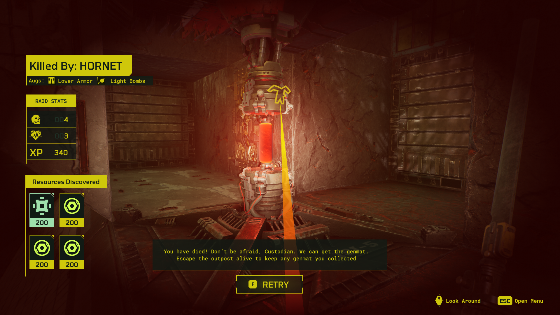
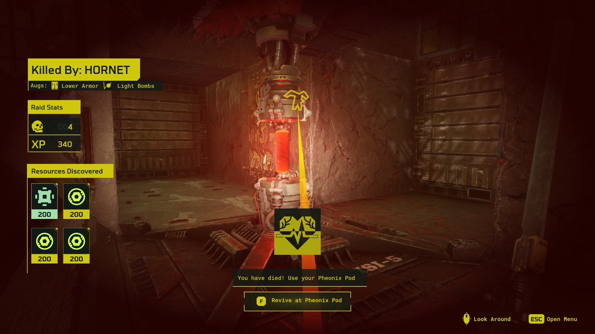
I was also responsible for the Death Screen in-game, which showed players what killed them and whether or not that enemy had any special equipment; the raider’s stats including kills, revives, or XP, and the resources discovered.

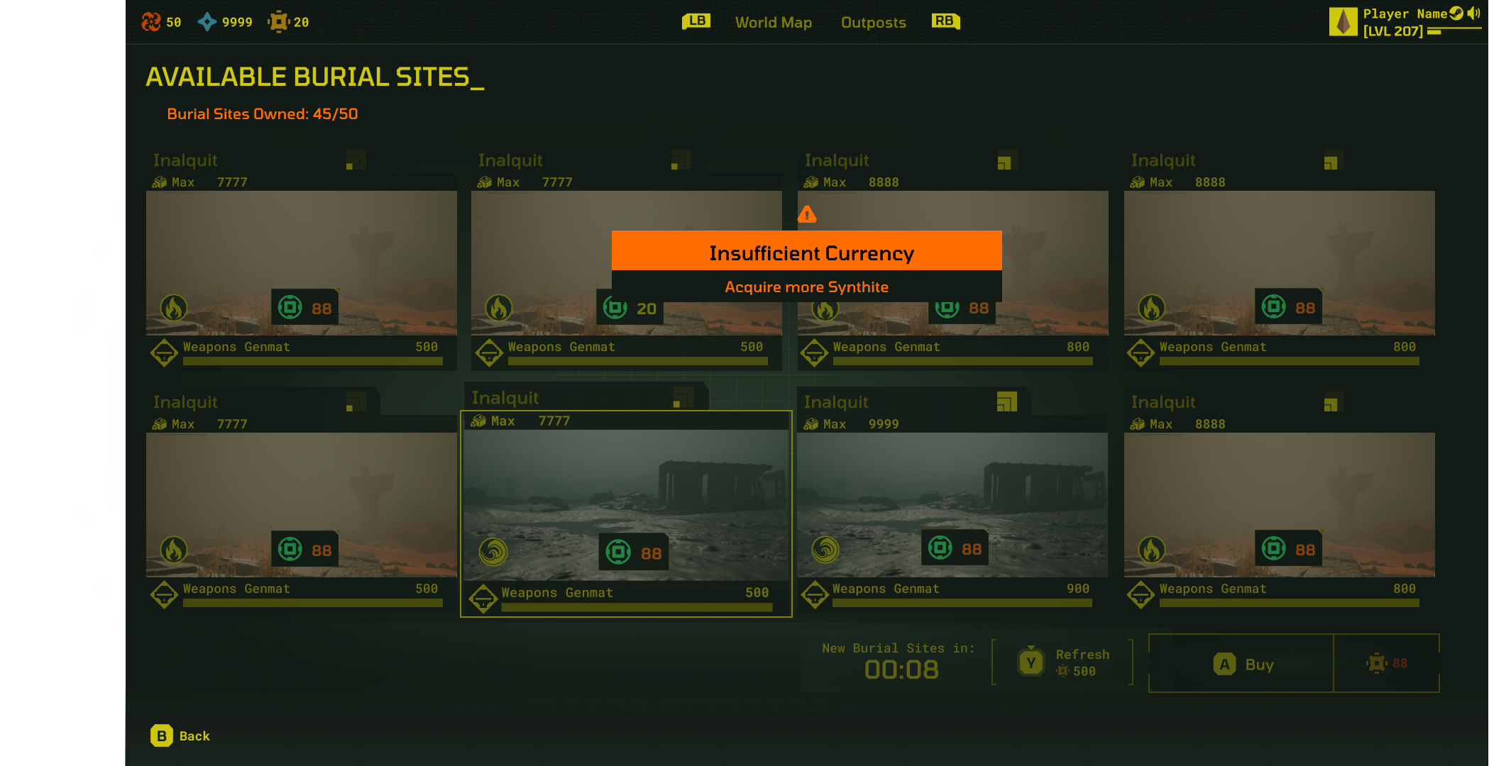
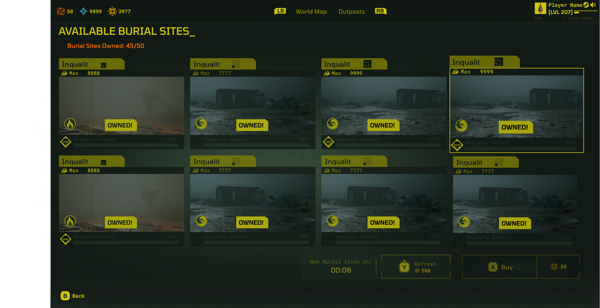
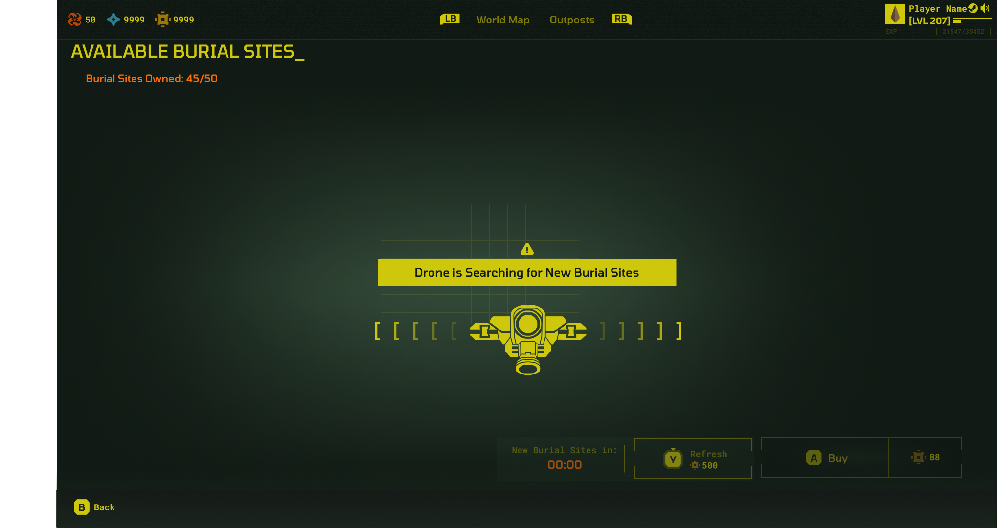
Plot of Land Store
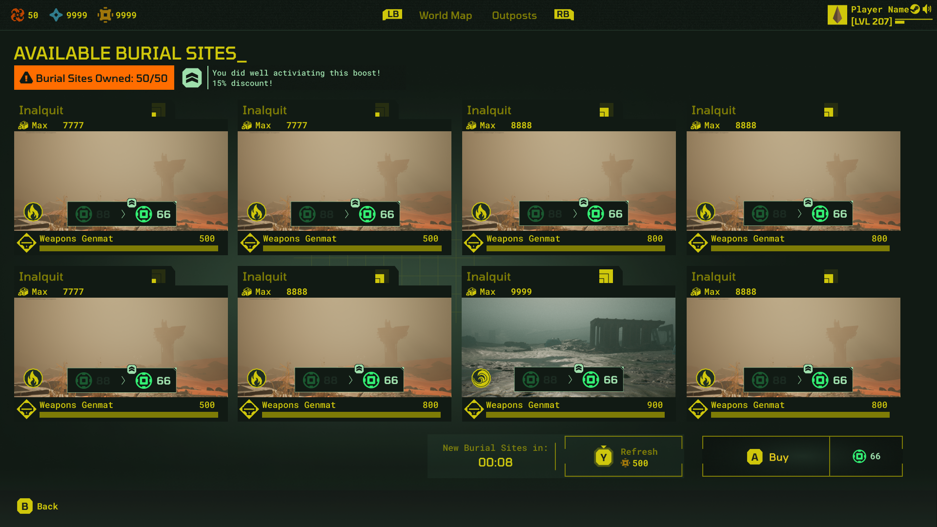
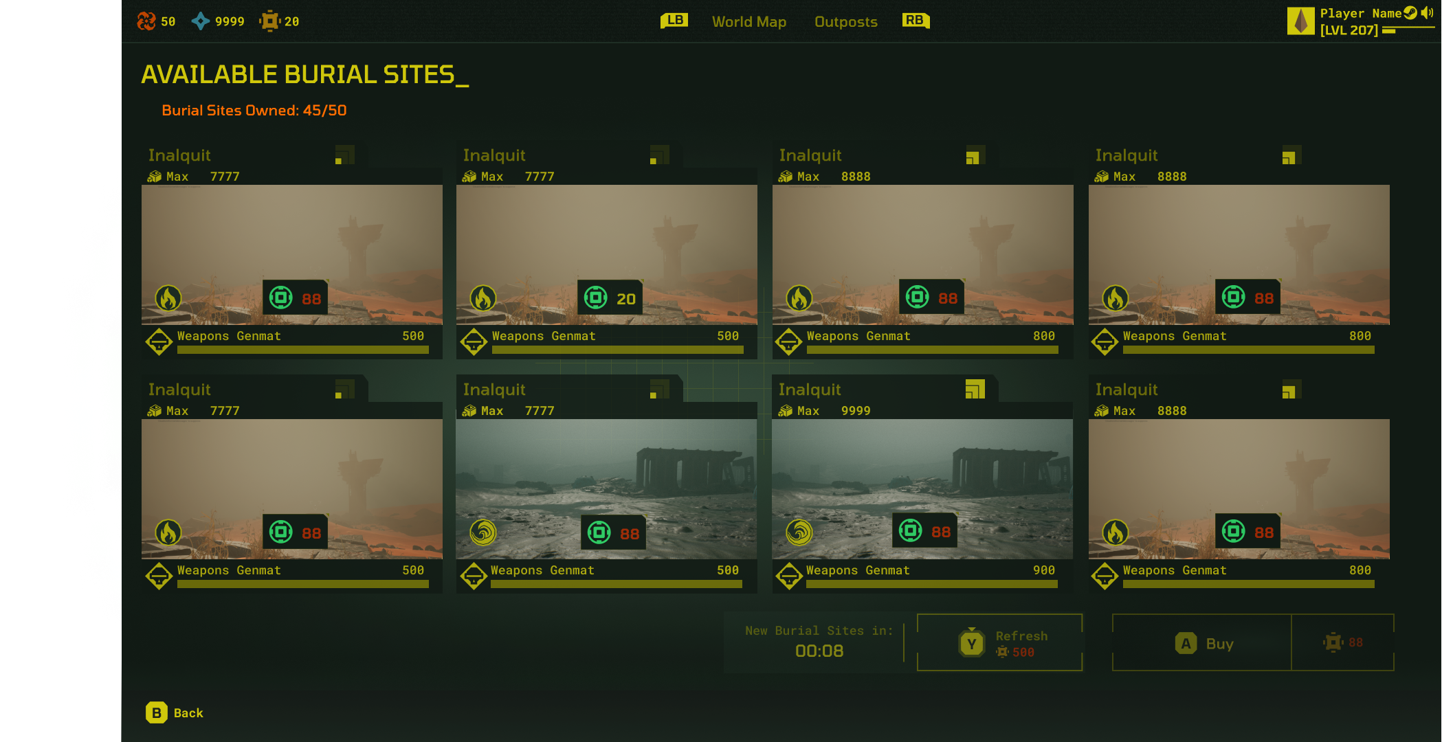
This screen needed to show players the different types of land they could purchase to build their base, the cost involved, its size, as well as how many plots of land the player currently owned. If you cycle through, you’ll see the various states for the screen, including the pop up and the drone that searches for new plots of land.
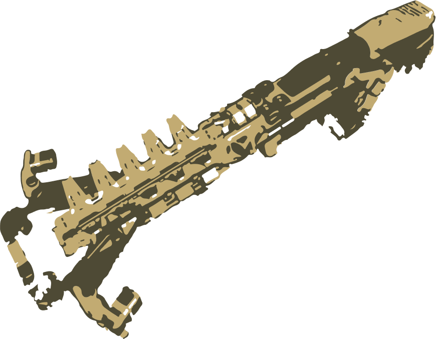
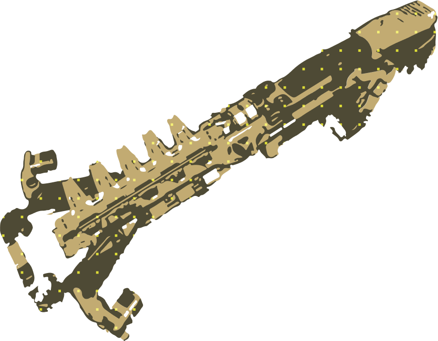
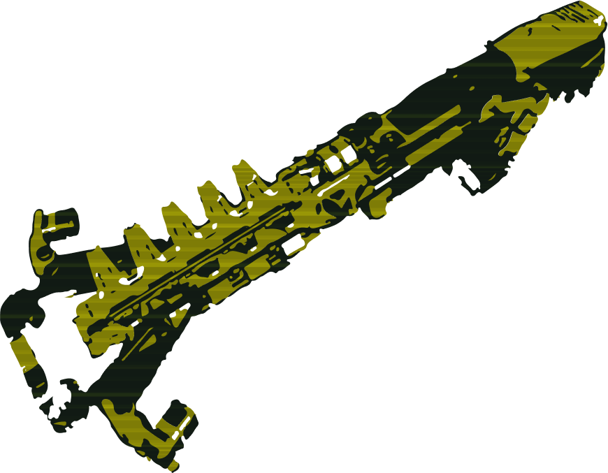
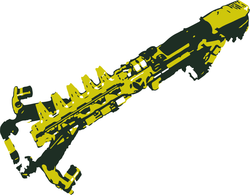
3D Asset Treatment Exploration
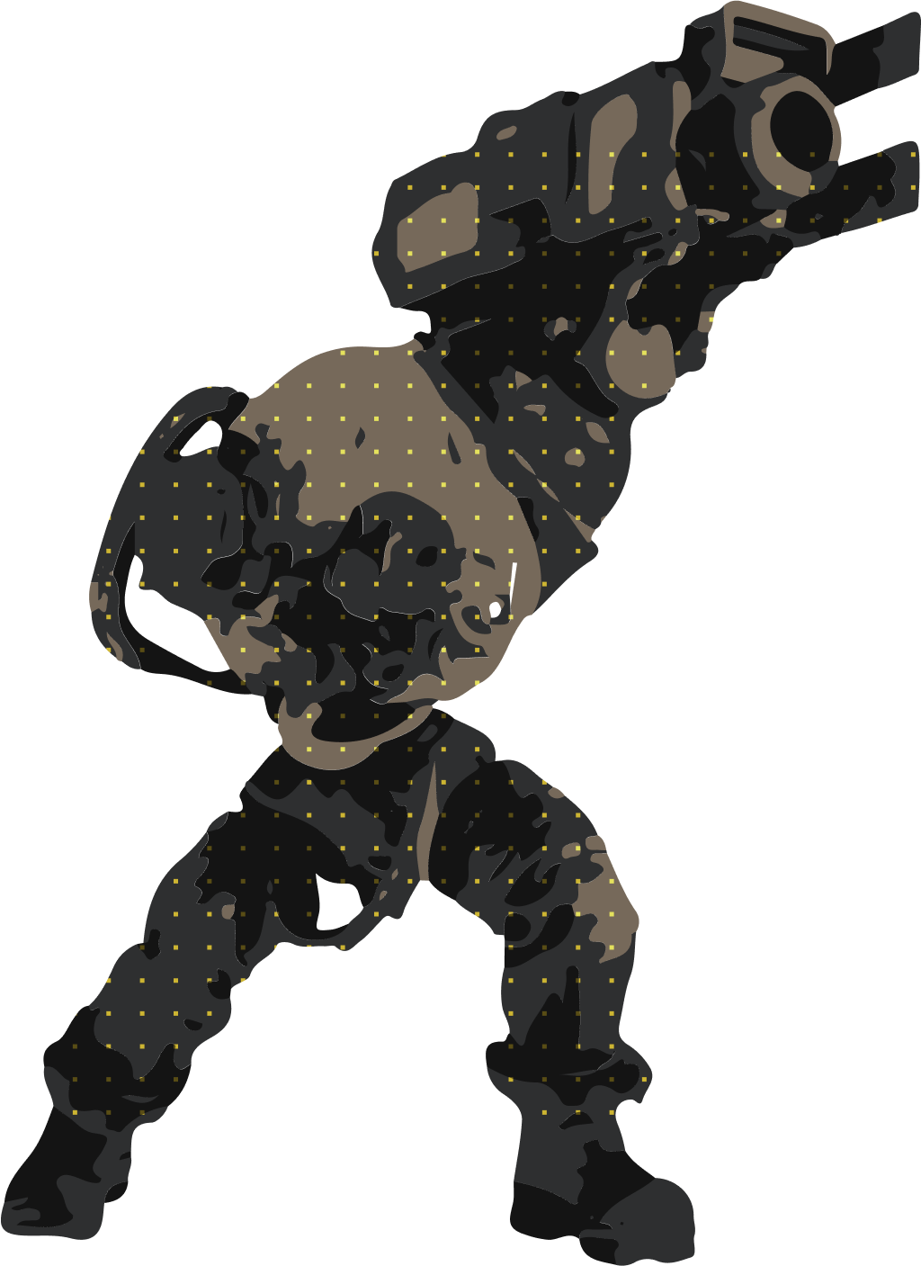
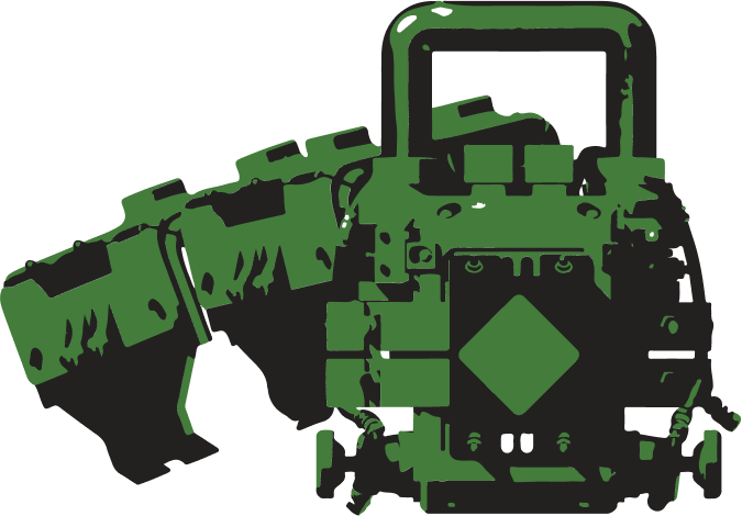
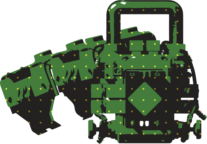
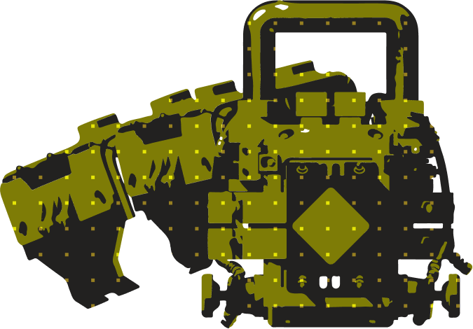
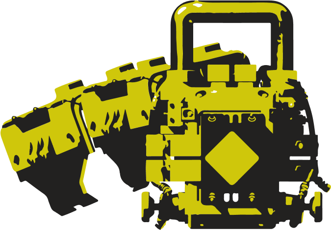
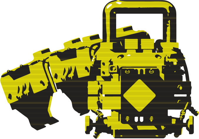
I used different textures and patterns overlaid on top of complex 3D assets to come up with a treatment style that we would use on all shop icons.
Animated Card Explorations
Proposed frame-by-frame states for animated card proposals.
